Patients drift from their care plans when there's nothing connecting them between clinic visits. SoteriaMe was designed to close that gap: building the habits and trust that keep patients engaged with their treatment when no one is watching.
At a glance
The problem
Infocare's desktop platform handled scheduling, records, and clinical workflows well. What it couldn't address was what happened to patients after they left the building. Without a connection to their care plan between visits, patients missed medications, forgot instructions, and drifted. Clinicians absorbed the cost as administrative overhead.
Infocare had tried to solve this with email. It hadn't worked. Patients in chronic care especially tend to have complex and variable digital literacy, and a generic email from a clinic name they half-recognised wasn't moving the needle. The brief was to design something that felt personal, trustworthy, and easy to use.
Research & discovery
GDPR and clinical governance frameworks limited direct patient access from the start. The approach relied on triangulation: eight interviews with consented patients through Infocare's clinical partners, four clinician workshops across three clinical sites, desk research and competitive analysis, and prototype testing with internal clinical advisors.
Running clinicians as the primary research lens filled a gap that direct patient access couldn't. Clinicians carry daily working knowledge of what patients forget to say in appointments, where they disengage, and what they misunderstand. That knowledge fed directly into the information architecture.
What this shaped
The arc had a clear message: anxiety doesn't go away; it just changes form. Three design principles came directly from this.
The research kept resolving into two people with opposite defaults. The patient needed less: less information, fewer choices, plainer language. The clinician needed more: more signal, more visibility, more automation. These composites carry the recurring patterns from the eight patient interviews and four clinician workshops. Every decision that follows had to serve both without shortchanging either.


Design approach
The dual constraint shaped every decision: simple enough for a patient with high cognitive load and variable digital literacy; signal-rich enough for a clinician with no time to read a second inbox. Every design problem was framed the same way: who needs this, when do they need it, and what happens to the other person if we get it wrong?
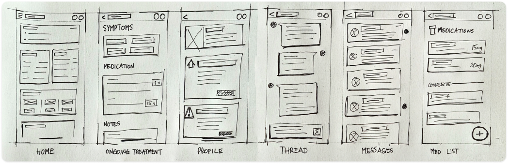
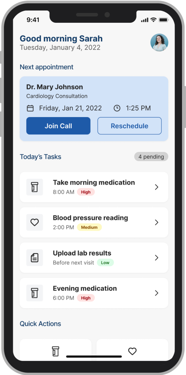
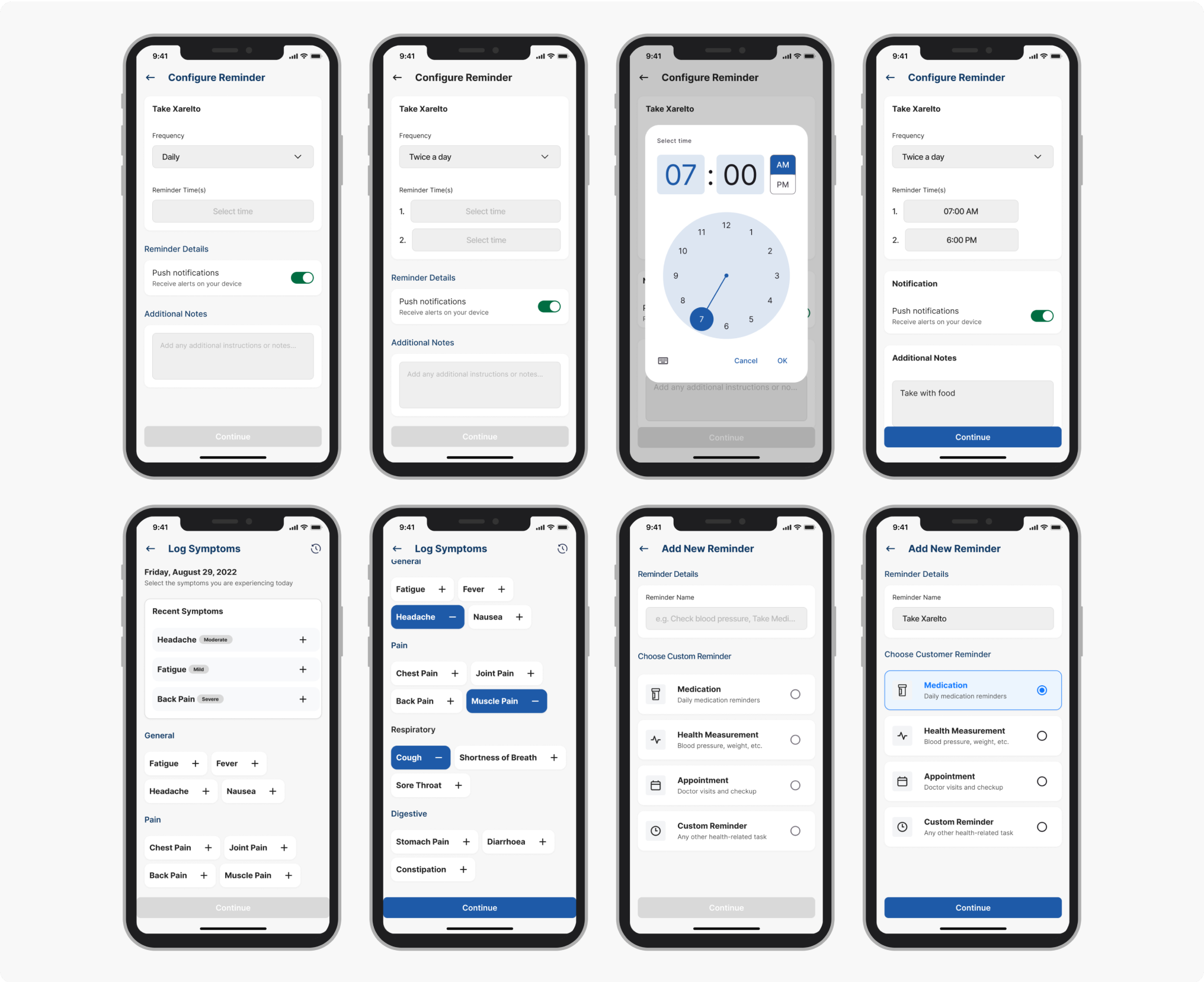
Paper sketches mapping the initial screen inventory: six core views before any wireframing. Home, Ongoing Treatment, Profile, Thread, Messages, Med List. Six views also meant six navigation items, which immediately raised the question of whether that cognitive overhead was appropriate for a user who might open the app for one purpose and leave in seconds. The answer was no. The shipped product dropped persistent navigation entirely: the dashboard became the single hub, with the next appointment as the primary action and every other view one tap from home.
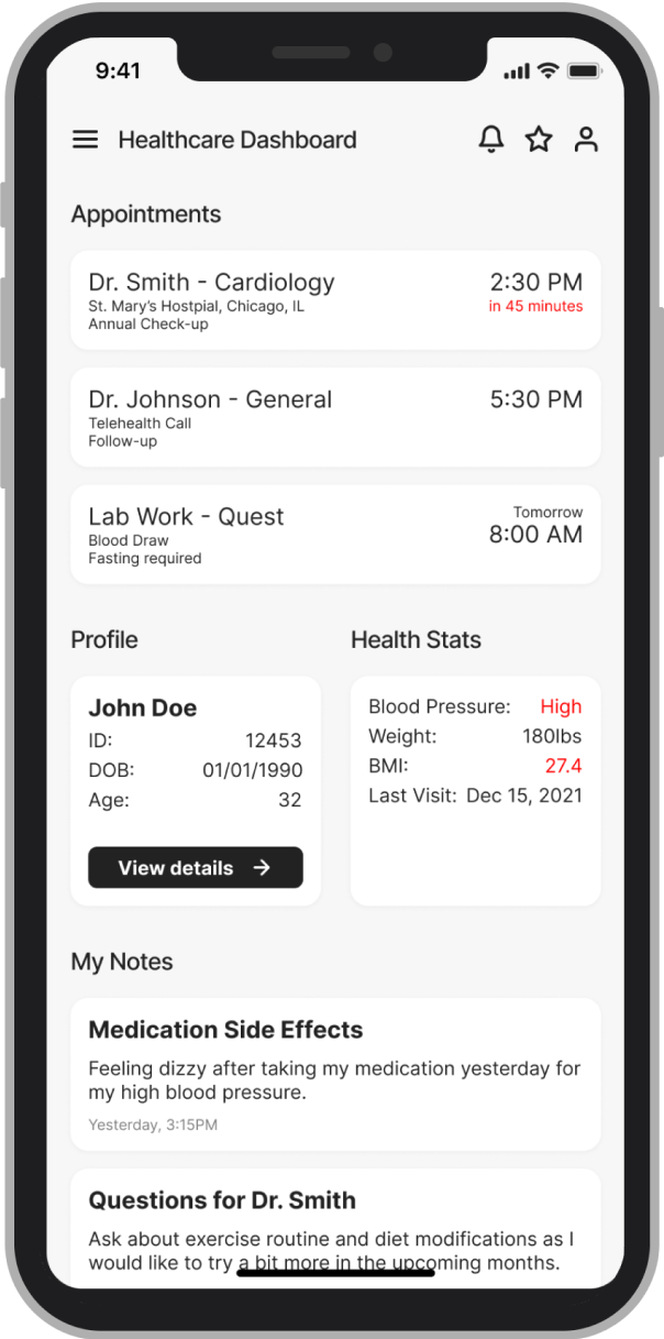
Early wireframes tried to surface everything at once: medications, appointments, symptom history, messages, wellness tips. Clinical advisors confirmed what the research implied: patients often arrive at a tool with cognitive load already high. A dashboard that required scanning before acting was going to be abandoned.
 Before
 After
After
The conventional fix for data anxiety is a consent screen at onboarding, which treats trust as a legal requirement and puts all the weight on a moment when patients are already overwhelmed.
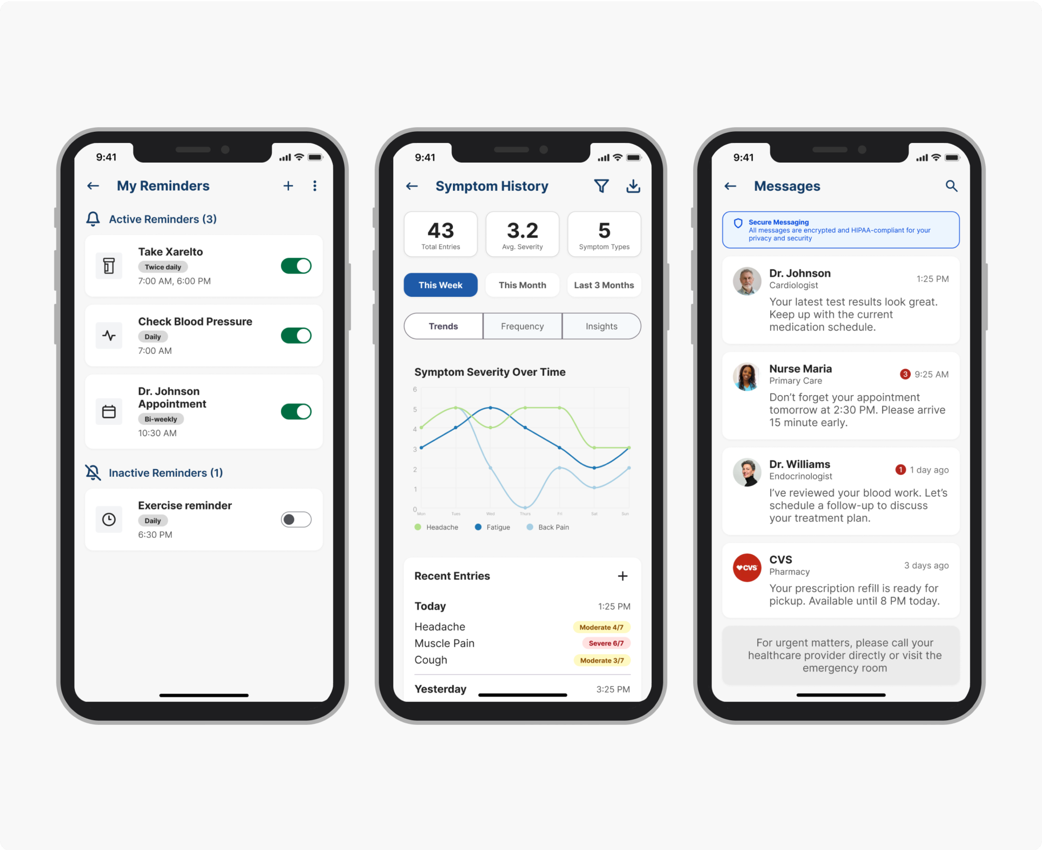
We added persistent, plain-language visibility labels at every point where patients entered data: "Shared with your care team" or "Only you can see this." Those small typographic decisions changed patient behaviour more than any structural design change in the product.
The patients using SoteriaMe were managing chronic conditions, often older and carrying multiple diagnoses. Reduced visual acuity, variable digital confidence, and elevated cognitive load were built into the design assumptions from day one; the team treated WCAG AA as a floor and designed beyond it.
The symptom severity scale originally used colour only: red, amber, green, clean and immediately legible to anyone with normal colour vision. Redesigning it to use both colour and icon label meant abandoning the cleaner version, but it was the only design that worked for patients with colour vision deficiencies, a significant portion of the target demographic. A more visually minimal scale would have failed them silently, and we would never have seen it in testing.
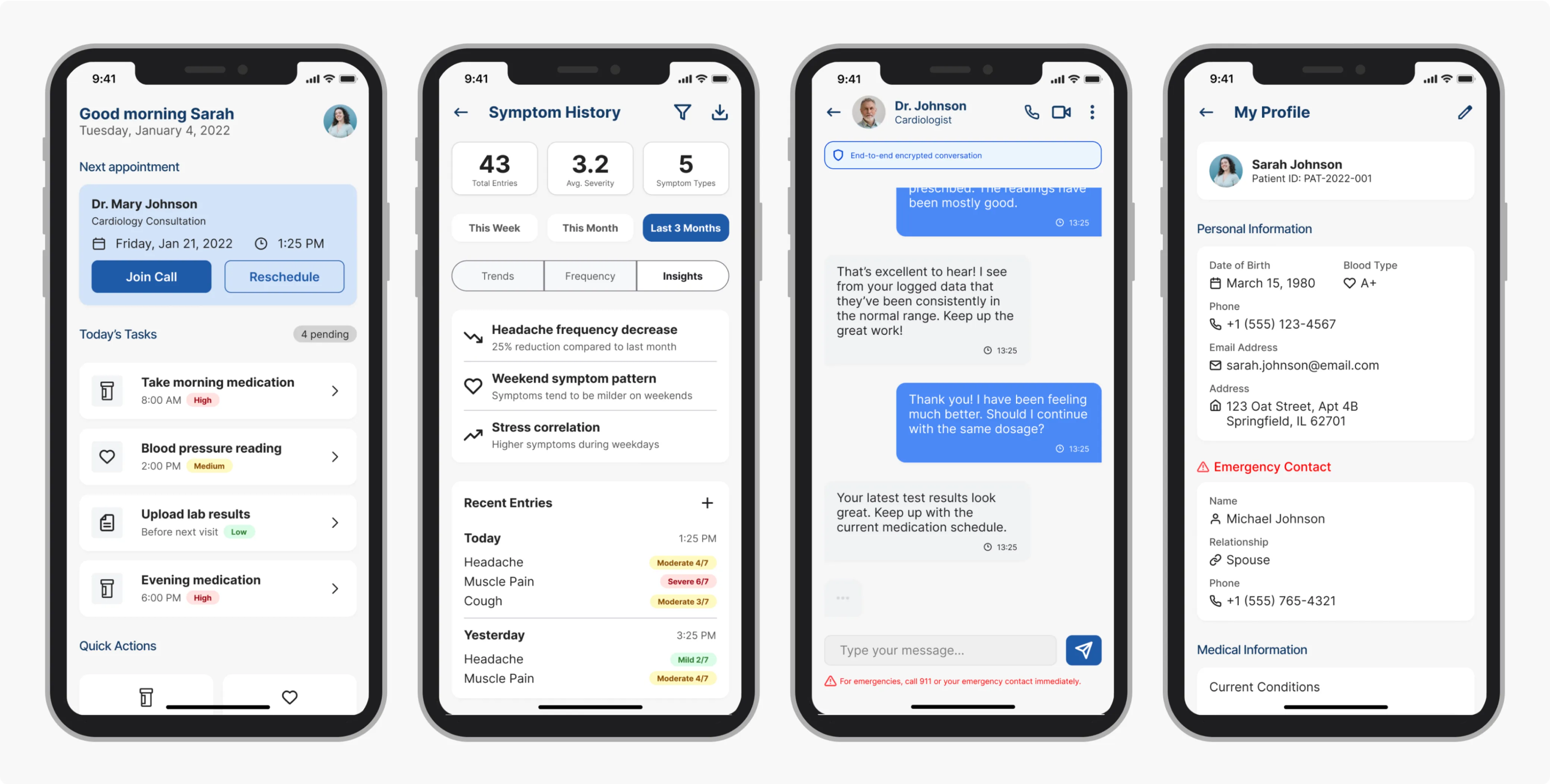
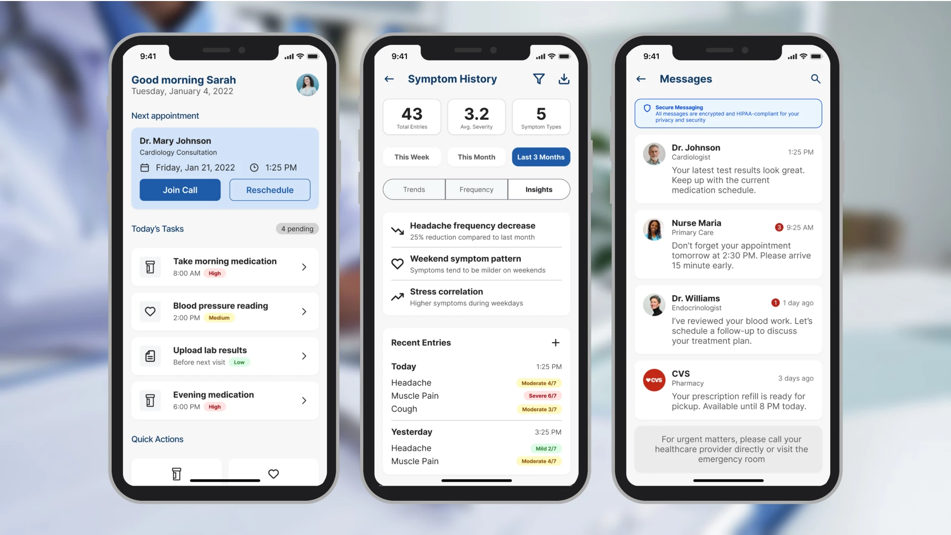
These four screens cover the three core patient jobs (checking the next appointment, managing reminders, logging symptoms) plus the profile screen where the data transparency controls live.
Testing was built to validate three hypotheses: that the IA hierarchy reduced time-to-first-action, that inline trust labels changed how patients expressed data anxiety, and that the accessibility baseline held under real-use conditions. Two of those three had been rebuilt at least once before testing began; the goal was to find what was still wrong.
Testing & validation
Testing ran across two structured rounds before the pilot. The objective was to find failure points early enough to fix them. Both rounds surfaced real problems and changed the product.
4 clinical advisors (GP, specialist nurse, clinical informatics lead, patient experience) walked through the full prototype against scripted scenarios: onboarding, dashboard first use, reminder setup, symptom logging, and messaging.
Their brief was to flag anything clinically inaccurate, structurally confusing, or likely to cause a patient harm by omission. They produced a prioritised issue list. Two issues were marked blockers and rebuilt before Round 2.
5 participants, ages 34–67, all managing chronic conditions, recruited through Infocare's clinical partners. Varied digital literacy, with two describing themselves as "not very good with phones." Sessions were 30 minutes each, think-aloud protocol, no instruction given on task completion.
Three tasks, no prompting: (1) locate your next appointment, (2) set a reminder for your evening medication, (3) log how you're feeling today, then find out who can see that entry.
11 seconds avg from dashboard landing, including both participants with low digital confidence.
3/5 couldn't locate or mis-navigated reminder setup in Round 1. After elevating it as a primary action, all 5 completed without prompting.
4/5 paused before submitting to ask who could see their entry. After inline labels were placed at point of entry ("Shared with your care team" / "Only you can see this"), zero participants hesitated in Round 2.
Outcome
SoteriaMe was piloted through Infocare's clinical partners across a small number of US clinics. The pilot ran without the instrumentation to measure engagement at scale, so the strongest evidence is qualitative, drawn from the testing rounds rather than the pilot itself.
"It's easier to remember what the doctor said when it's all written down here."
"I can see when patients are actually engaging, not just waiting until the next visit."
Both quotes are describing the same thing: the app created a record patients could reference between appointments, and gave clinicians visibility into what patients were doing between visits. That was what it was built to do.
Beyond the pilot, SoteriaMe served a second purpose Infocare cared about equally: demonstrating that they could build a credible patient-facing digital product. Their existing reputation was built entirely on desktop clinical infrastructure. A working mobile health app opened new commercial ground, and was used directly in conversations with prospective healthcare clients.
If I were running this project again with a proper measurement framework, I'd have established a baseline appointment-miss rate before launch, tracked medication log completion rates in-app, and run a cohort comparison between engaged and disengaged users against downstream clinical outcomes. None of that was feasible within the project's scope. Worth naming anyway.
Both user groups were placing trust in the product: patients that their data was safe, clinicians that what they saw was accurate. That's a harder brief than it sounds, and it shaped every decision from the IA to the inline data labels.