Sellers bypassed the Back Office homepage because it offered nothing worth stopping for. Redesigning the content layer turned it into the most-visited page in the product.
At a glance
The problem
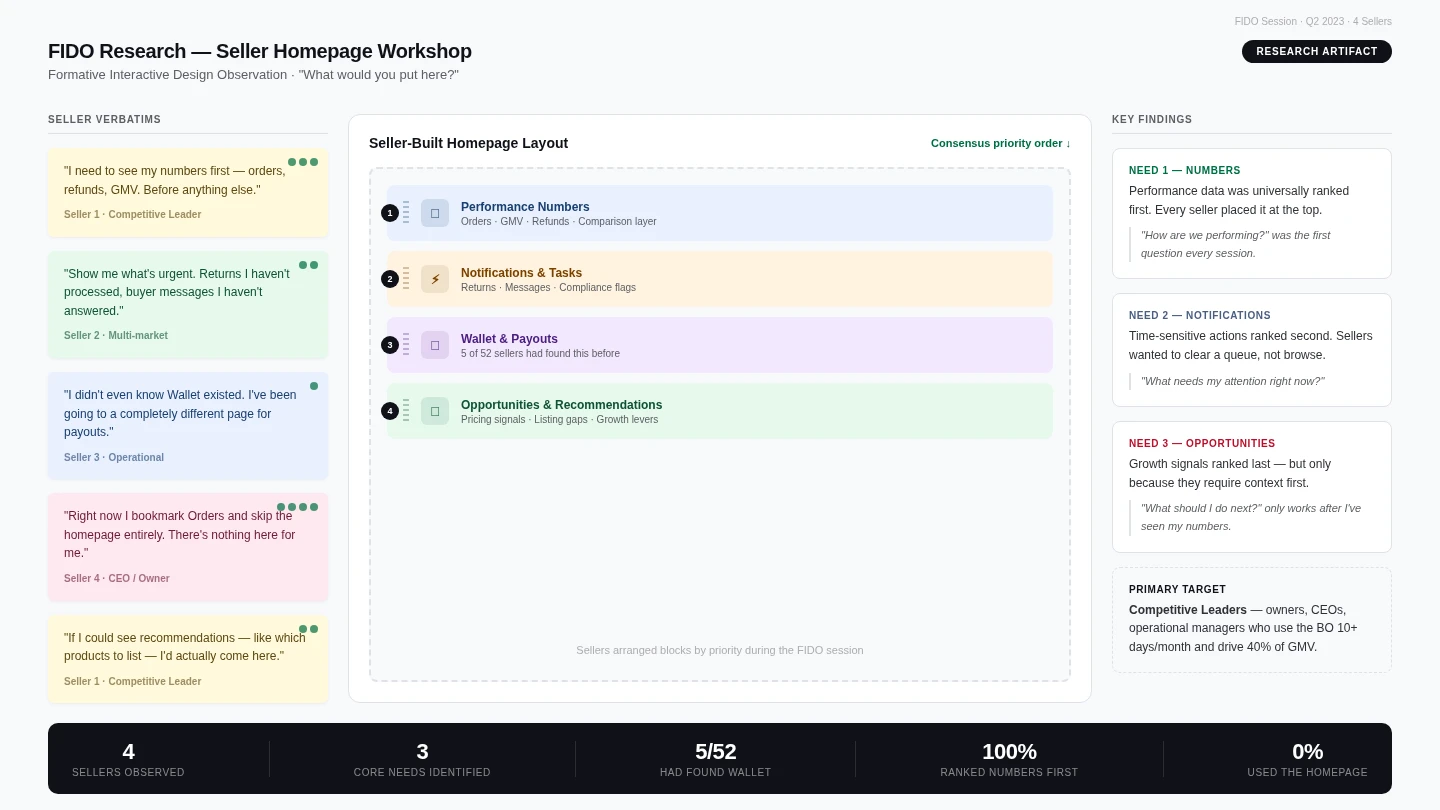
The Back Office homepage was technically functional and practically invisible. Sellers had carved their own paths through the product, bookmarking Orders, Insights, and Listings, and were routing around the homepage entirely. A FIDO study confirmed what the usage data already showed: sellers weren't asking for a better homepage because they'd stopped expecting anything from it.
The 2022 platform migration had shipped technical parity but left a fundamental question unanswered: what should a seller actually look at when they arrive? The homepage had no answer to that question, and a homepage with no answer is one sellers stop opening.
"The homepage is rarely used by anyone. Sellers bookmark other tabs and skip the homepage entirely."
Three needs emerged: Numbers (how am I performing), Notifications (what needs my attention), and Opportunities (what should I do next). The research also named Competitive Leaders (owners, CEOs, operational managers) as the primary design target.
Benchmarking against Amazon Seller Central, Shopify Analytics, and Mirakl confirmed the gap: every reference was either single-market or analytics-heavy with no action-orientation. There was no template to copy.
Scope & Ownership
The FIDO research established the problem clearly. What didn't exist yet was a content strategy: a considered answer to what sellers should actually see when they open the Back Office.
I designed the full content layer of the homepage: six new content blocks, a rebuilt data architecture for Back Market's Dynamic Pricing model, and a consistency review spanning six seller-facing surfaces.
The scope stretched well beyond a single screen. As the SellerXP designer, I held design ownership across six surfaces simultaneously: homepage, listings, orders, cost summary, finance report, and tooltips, each with its own engineering team, existing patterns, and its own answer to which price to display. Getting them to a consistent answer required commercial and finance sign-off.
The 1,700-seller base added a harder structural constraint: one layout, no segmentation, built for two very different audiences. Business owners doing a morning performance review. Operational sellers clearing a task queue. Designing for both meant making a deliberate call about who mattered most, and being prepared to defend it.
Design approach
The FIDO research established how sellers actually start a session: three questions, in the same order, every time. The homepage needed to answer them before sellers navigated somewhere else.
I explored three layout directions before committing to anything. A dashboard-heavy layout with filterable charts was rejected first; it asked sellers to analyse at the exact moment they were arriving to get their bearings. A notification-first feed was rejected because it surfaces urgency without context: a seller can see something needs attention without knowing whether their overall performance is good or bad.
The editorial block model, developed jointly with a Content Designer (since a homepage is as much an editorial product as a functional one), won because it separates concerns cleanly. Performance first, tasks second, recommended actions last. Each block answers one question, in the order a seller naturally asks it.
One homepage. 1,700 sellers with different businesses, markets, and priorities. FIDO showed that different seller types wanted different things: Competitive Leaders wanted performance data; operationally focused sellers wanted task queues. A single static layout couldn't serve both equally. Key Decision 1 covers how that was resolved.
The validation came from usage data: the homepage became the most-visited page in the Back Office, above Orders, Wallet, and Insights, within twelve months.
Key decisions
FIDO identified two distinct seller types. Competitive Leaders — owners, CEOs, operational managers — started every session asking how the business was doing. Operationally focused sellers came in to clear their queue: processing returns, answering messages, chasing compliance flags. A single static layout couldn't serve both equally.
The safe option was to optimise for the most common seller type. But Competitive Leaders are 20% of sellers and drive 40% of GMV at twice the revenue per seller of the operational segment. When the PM pushed to design for the majority, the reframe that landed was: "We're not ignoring 80% of sellers. We're building for the users whose behaviour most directly affects platform health."
The layout would underserve operationally focused sellers in the short term, and that was an accepted trade-off. Personalisation was the planned next step. In 2024, the question was whether the homepage was worth opening at all.
Competitive Leaders generate 2× the average GMV per seller. Designing for the majority means optimising for the segment with less commercial weight per decision.
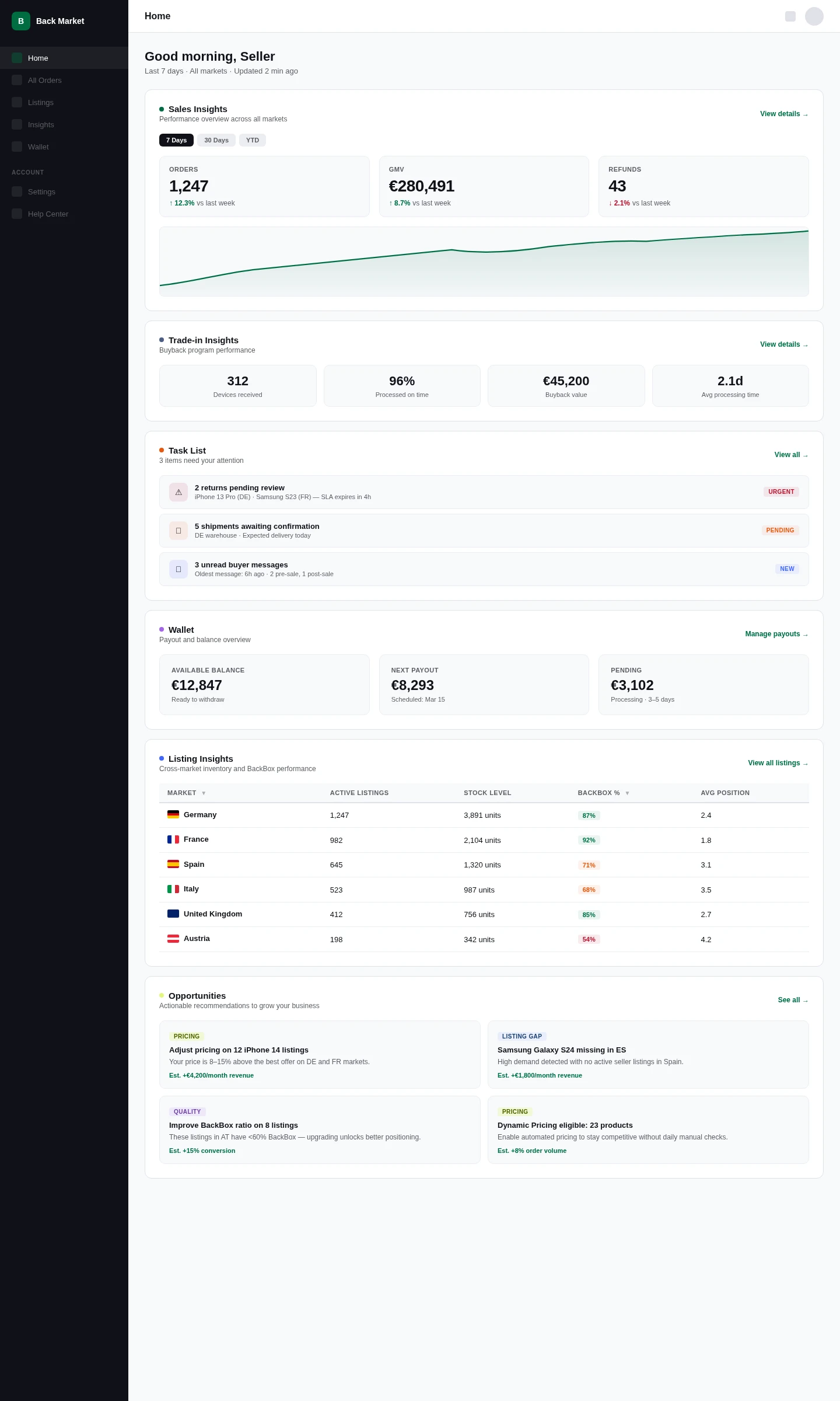
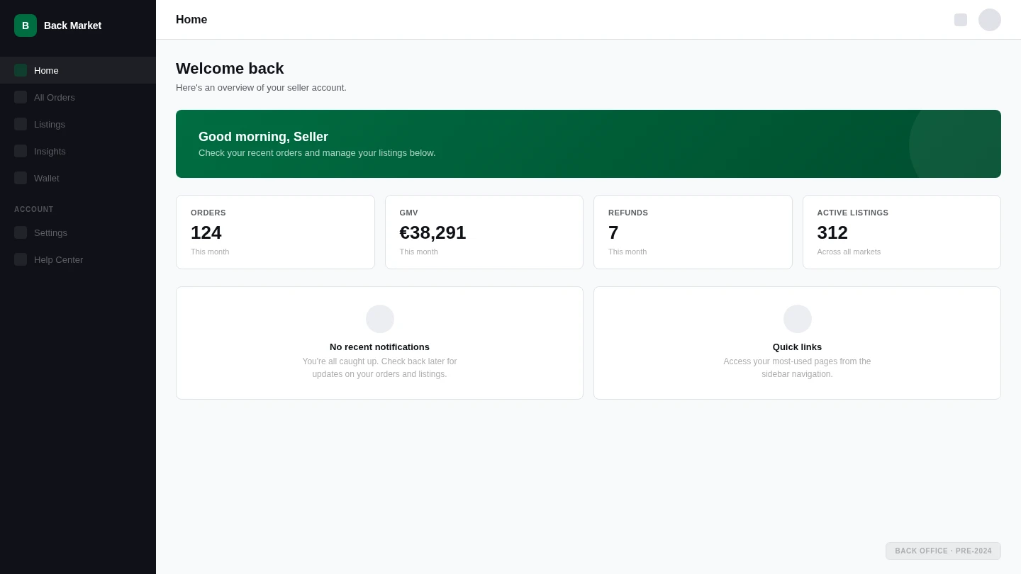
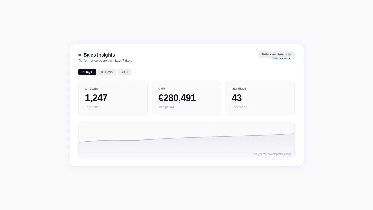
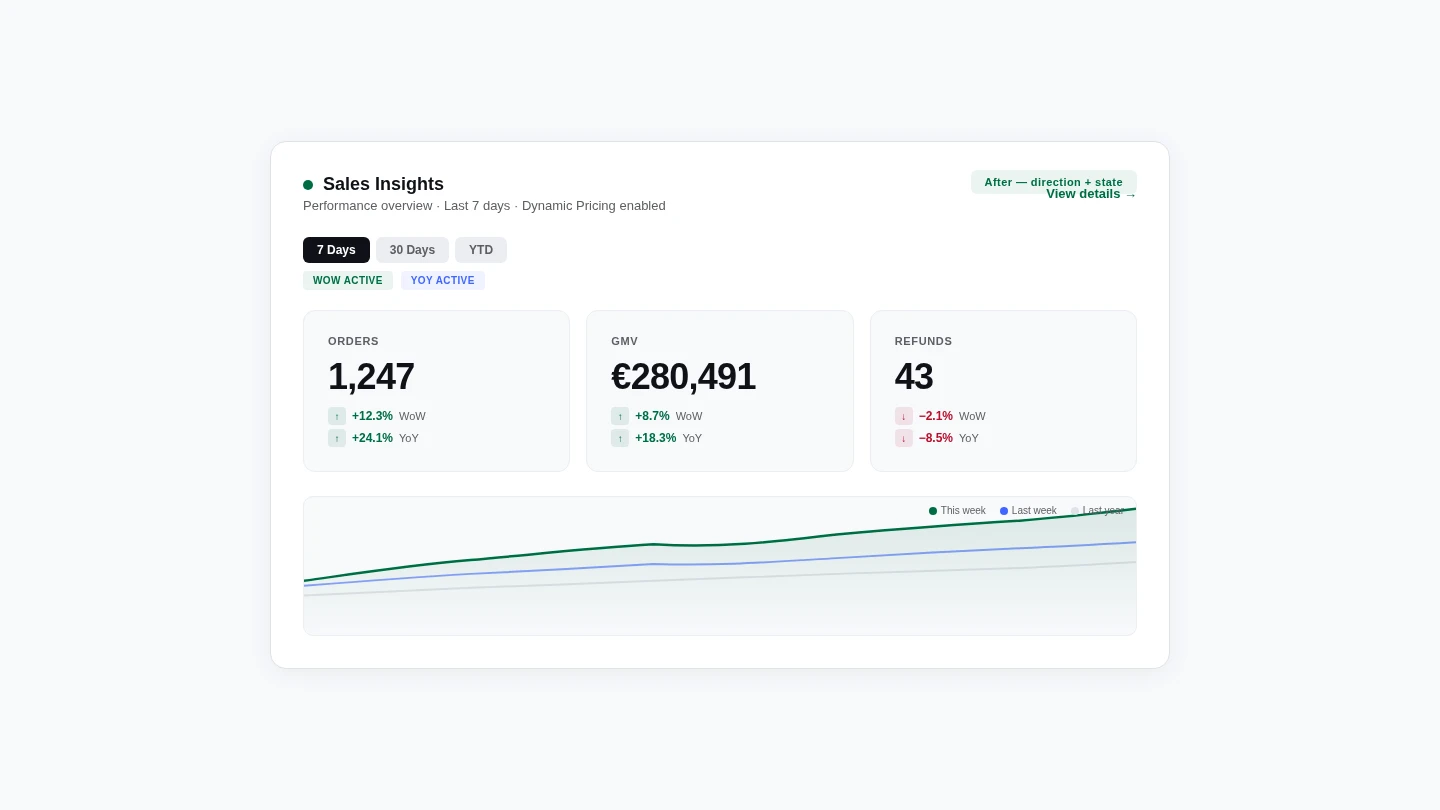
The original Sales Insights block showed raw numbers: orders this month, GMV this month. Clean, minimal, and almost useless. A seller looking at €38,000 in GMV has no way of knowing whether that's good, bad, or the same as last week without a comparison period.
The team pushed for filterable date ranges, exportable charts, and multiple simultaneous metrics. But adding those controls would have turned an orientation surface into a second Insights page, undermining the one that already did that job. One clear signal per performance area — enough to tell a seller whether the Insights page is worth opening today.
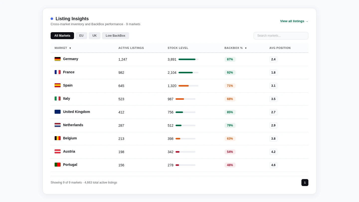
Back Market's Dynamic Pricing Up model introduced an adjustment fee on top of the seller's listed price. The customer pays more; the seller's payout doesn't change. For the first time in the BO, three different numbers coexisted where one had always been sufficient.
The homepage Sales Insights block had to make a deliberate editorial call: show €280, not €302. Showing the inflated figure would have given sellers a false read on their own revenue, and that kind of error on a financial surface compounds quickly.
The same call had to be made consistently across every surface where a price appeared. Inconsistency across six screens would have left sellers seeing different figures depending on where they looked.
Outcome
In Q1 2024, FIDO research confirmed what usage patterns already showed: sellers had stopped using the homepage. By Q2 2025, it had become the single most visited page in the entire Back Office. The only material change between those two data points was the redesign.
From approximately 4,800 visits/month at the December 2023 baseline to over 22,000 visits/month by Q2 2025, roughly a fivefold increase over eighteen months, ending above All Orders, Wallet/Invoice, Insights, and every other page in the Back Office.
Q1 to Q4 2025 (1,820 → 6,700 clicks/quarter). While seller email performance declined YoY, in-product engagement (built on the homepage as its foundation) became Back Market's highest-converting seller comms channel.
"A unified command center that helps you increase sales volume while spending less time on administrative tasks."
How Back Market framed the homepage at BackForum 2025. The unified command center framing maps to the original three-question structure: performance, tasks, next actions.
The redesign established that the surface was worth using. What usage data can't tell you is whether sellers are getting what they actually came for, or just stopping by out of habit. Personalisation for different seller types is still on the roadmap and hasn't shipped yet.
Reflection
The redesign worked, but two structural calls are worth flagging. Both were defensible at the time and would be the first things I'd revisit on a second pass.
The six-surface price audit only happened because Dynamic Pricing forced it mid-project. With hindsight, surface-mapping should be a standard part of the brief on any system-level redesign, not a discovery triggered by an external launch. It would have saved late-stage rework and made the commercial sign-off conversation easier.
Designing for Competitive Leaders was the correct call given the constraint, but the constraint itself is worth challenging. Operationally focused sellers represent 60% of GMV; underserving them in the short term compounds. Personalisation is on the roadmap, and the right metric for whether this redesign succeeded long-term is whether the operational segment's session quality improves once it ships.
The Back Office homepage went from the screen sellers bypassed to the surface Back Market chose to carry its most significant pricing change. When Dynamic Pricing launched, Back Market surfaced the new revenue figures through the homepage. Sellers trusted a number they'd never seen before on a page they'd only started checking a year earlier.