Closing the gap between appointments.
- Role
- Product Designer, end to end
- Timeline
- 2022
- Working with
- Mobile developers, product manager, clinical advisors, clinical partners
- Status
- Closed beta, US clinics
The short version. Infocare’s first patient-facing product: a mobile app that keeps chronic-care patients connected to their care plan between visits. I designed it end to end under gated patient access, and the trust mechanics, plain-language visibility labels at every point of data entry, changed patient behaviour more than any structural decision in the product.
Outcome Infocare’s first patient-facing product, in beta with US clinics
Infocare’s desktop platform handled scheduling, records, and clinical workflows well. What it couldn’t address was what happened to patients after they left the building. Without a connection to their care plan between visits, patients missed medications, forgot instructions, and drifted. Clinicians absorbed the cost as administrative overhead.
Infocare had tried to solve this with email. It hadn’t worked. Patients in chronic care tend to have complex and variable digital literacy, and a generic email from a clinic name they half-recognised wasn’t moving the needle. The brief was to design something that felt personal, trustworthy, and easy to use. It was also the company’s first patient-facing product, which made it a reputational bet as much as a design brief.
Before
weeks of nothing: missed medications, forgotten instructions, drift
With SoteriaMe
- medication reminder
- care-plan check-in
- plain-language update
- symptom note
- appointment prep
Nobody could talk to the patients.
GDPR and clinical governance frameworks limited direct patient access from the start. I triangulated instead: eight interviews with consented patients through Infocare’s clinical partners, four clinician workshops across three clinical sites, desk research and competitive analysis, and prototype testing with internal clinical advisors.
Running clinicians as my primary research lens filled a gap that direct patient access couldn’t. Clinicians carry daily working knowledge of what patients forget to say in appointments, where they disengage, and what they misunderstand. That knowledge fed directly into the information architecture.
Every note is grouped where it landed at the time, and the two clusters that ran heaviest — trust and patient needs — are the two the product was eventually organised around.
- Appointment reminders in plain language
- Medication nudges at the right time
- Simple symptom logging
- A single, unified view of their care plan
- Support for low digital confidence
- “I forget what the doctor said by the time I get home”
- Wants one place to look, not five
The insight
Patients arrive with one question, not a browsing habit.
What it changed
Persistent navigation dropped entirely. The dashboard became a single hub with the next appointment as the primary action.
- At-a-glance engagement indicators
- Integration with existing EHR workflows
- A signal layer, not a data feed
- Lightweight, no added reading burden
- Automated follow-up prompts
- “I will not check another inbox”
The insight
Clinicians will accept signal, not another queue.
What it changed
Engagement surfaces inside the message thread clinicians already read, rather than in a separate dashboard nobody agreed to check.
- Privacy-first onboarding
- Trustworthy, official appearance
- GDPR and clinical governance compliance
- Structural reassurance, not policy links
- Visible data labels at the point of entry
- “Who sees this if I write it down?”
- Hesitates before downloading — is this really from the clinic?
- Consent screen read once, remembered by nobody
The insight
Trust is asked for at the moment of entry, not at onboarding.
What it changed
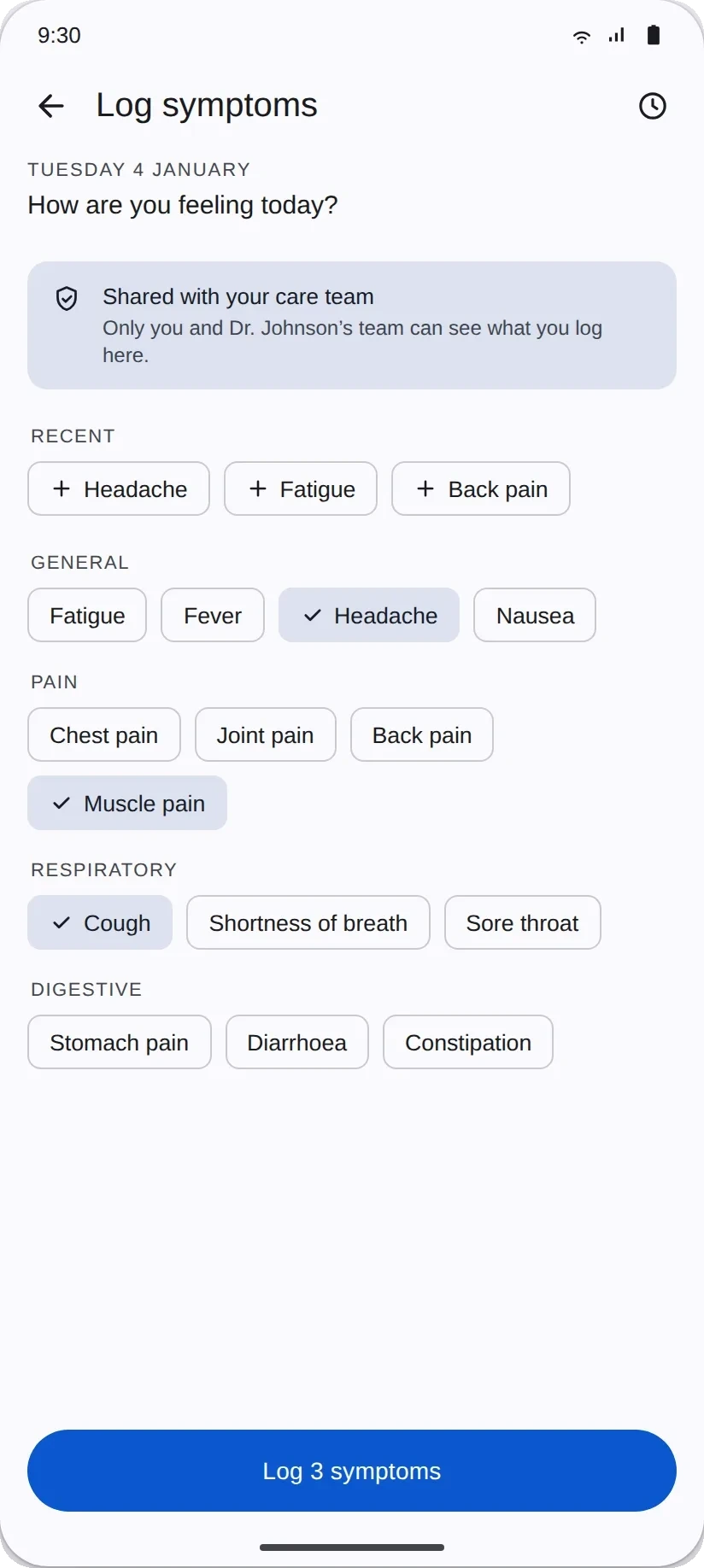
Plain-language visibility labels at every point where a patient enters data: “Shared with your care team,” or “Only you can see this.”
- Scalable across different clinic types
- Low digital adoption in the target demographic
- Existing tools: phone calls and paper notes
- Must not compete with clinical judgment
- Mobile-first for patient access
- Often older, often multiple diagnoses
The insight
The floor matters more than the ceiling in this demographic.
What it changed
WCAG AA treated as a minimum. The severity scale carries colour, icon and label together rather than colour alone.
Positive
Stressed
-
01
Discovery
Overwhelmed, anxious
- Searches for the app or receives a clinic referral
- Reads the store listing and reviews
- Hesitates before downloading
Key design need
Trust before commitment. Reassurance that this is official and safe, before the download.
-
02
Registration
Hopeful but unsure
- Creates an account with a clinic code
- Reads the consent screen
- Completes a basic profile
Key design need
Plain-language explanation of what data is shared, when, and with whom, before it is asked for.
-
03
First use
Overloaded
- Lands on the dashboard for the first time
- Looks for the next appointment
- Sets a first medication reminder
Key design need
One obvious primary action. Not a dashboard requiring exploration, but an answer to “what do I do now?”
-
04
Ongoing use
Anxious, uncertain
- Logs symptoms between visits
- Checks reminders and messages
- Wonders who can see what they enter
Key design need
Persistent, visible context at the point of entry: “shared with your care team” or “only you can see this.”
The research kept resolving into two people with opposite defaults. The patient needed less: less information, fewer choices, plainer language. The clinician needed more: more signal, more visibility, more automation. Every decision that followed had to serve both without shortchanging either.
Three principles came directly out of the journey work. Earn trust before asking for data. One thing at a time. Make data visibility persistent and contextual.
Trust turned out to be typography.
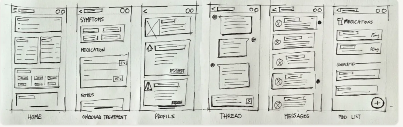
Early wireframes tried to surface everything at once: medications, appointments, symptom history, messages, wellness tips. Clinical advisors confirmed what the research implied: patients often arrive at the tool with cognitive load already high, and a dashboard that required scanning before acting was going to be abandoned.
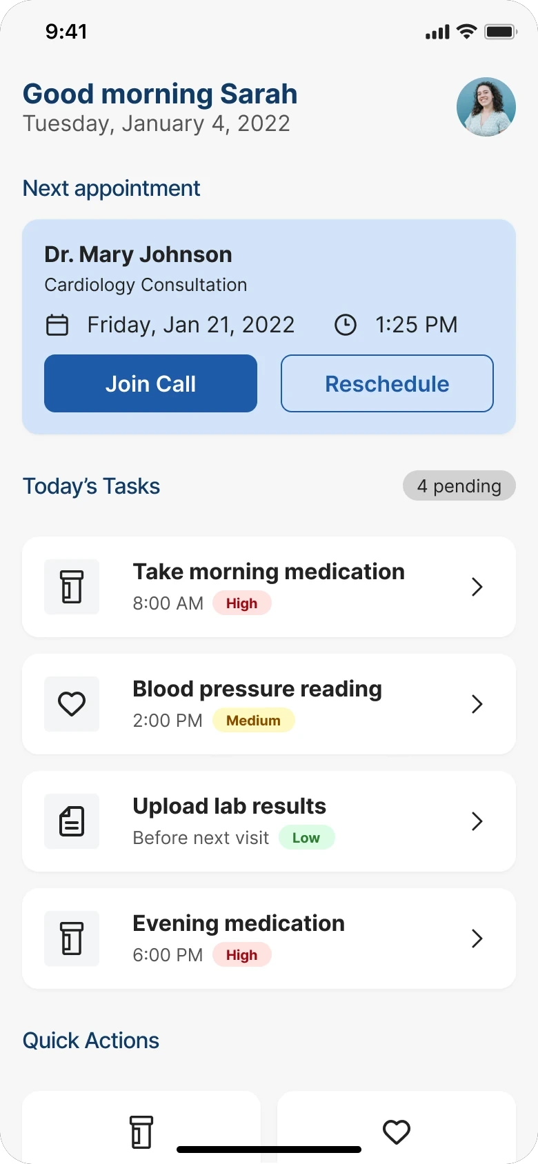
My answer was to drop persistent navigation entirely. The dashboard became the single hub, the next appointment the primary action, and every other view one tap from home.
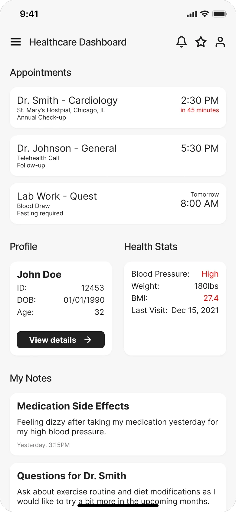
The conventional fix for data anxiety is a consent screen at onboarding, which treats trust as a legal requirement and puts all the weight on a moment when patients are already overwhelmed. Instead, I put persistent plain-language visibility labels at every point where patients enter data: “Shared with your care team,” or “Only you can see this.” Those small typographic decisions turned out to matter more than any structural change I made — the testing numbers ahead show exactly how much.
The patients using SoteriaMe were managing chronic conditions, often older, often carrying multiple diagnoses. I treated WCAG AA as a floor. The symptom severity scale originally used colour only: red, amber, green, clear and immediately legible to anyone with normal colour vision. I redesigned it to use colour, icon, and label together, abandoning the cleaner version, because it was the only design that worked for patients with colour vision deficiencies. A more minimal scale would have failed them silently, and the failure would never have surfaced in testing.
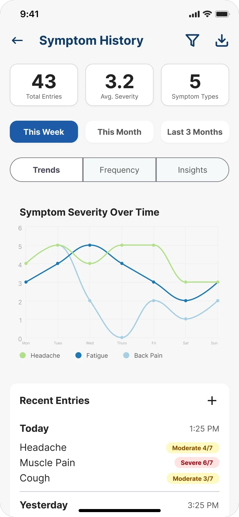
Watch it fail. Then fix that.
Before any patient saw it, four clinical advisors (a GP, a specialist nurse, a clinical informatics lead, and patient experience) went through the full prototype against scripted scenarios, briefed to flag anything clinically inaccurate, structurally confusing, or likely to cause patient harm by omission. Two issues were marked blockers and rebuilt before patient testing began.
Then two rounds with patients: five participants aged 34 to 67, all managing chronic conditions, think-aloud protocol, three tasks with no prompting. Round one showed where the design was failing them. I rebuilt the two flows it broke on and ran the same tasks again in round two.
Small numbers, treated as small numbers, and the same five people both times — so familiarity is doing some of the work in the second column. What they showed was still direct.
- from three of five to 5 of 5
- Participants completing reminder setup, once it was rebuilt as a primary action
- from four of five to 0 of 5
- Participants stopping at data entry to ask who could see it, once inline visibility labels were added
-
01
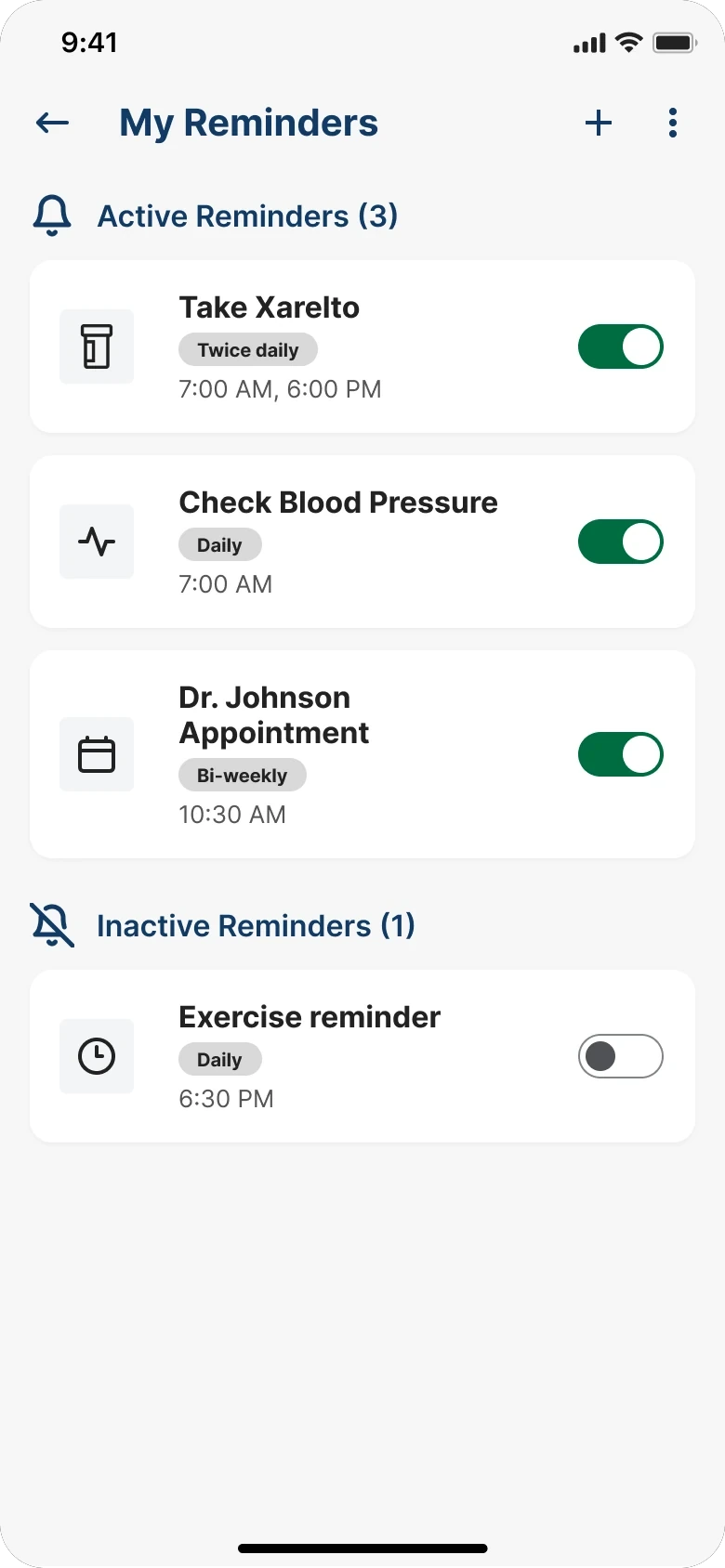
My reminders
The entry point, rebuilt as a primary action
-
02
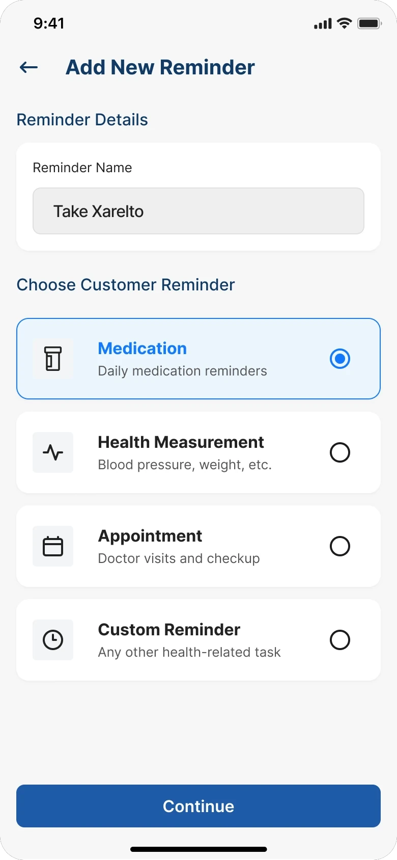
Add reminder
Name it, pick a type
-
03
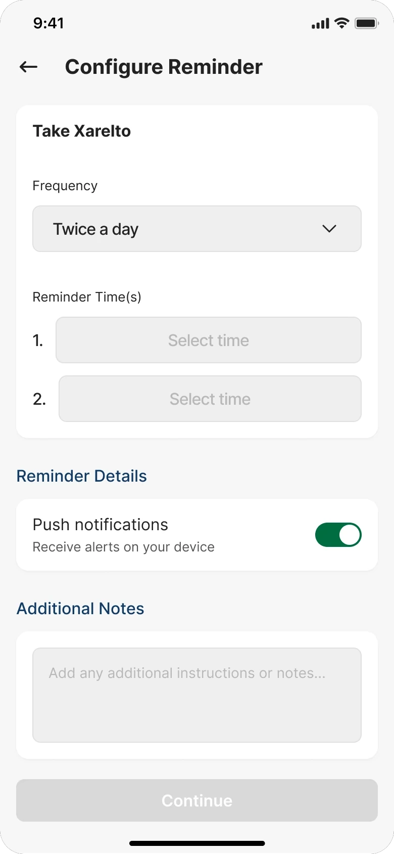
Configure
Frequency, times, notifications
-
04
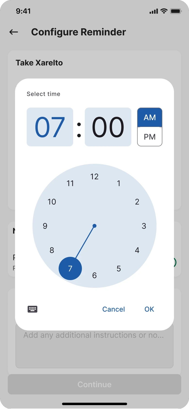
Select time
Platform-native picker
Nothing inside those four screens changed much between rounds. What changed was how you got to them: reminders had been a row inside a settings list, and became a named destination with an add button in its own header. Two of five participants never found the old route. All five walked the new one without being asked twice.
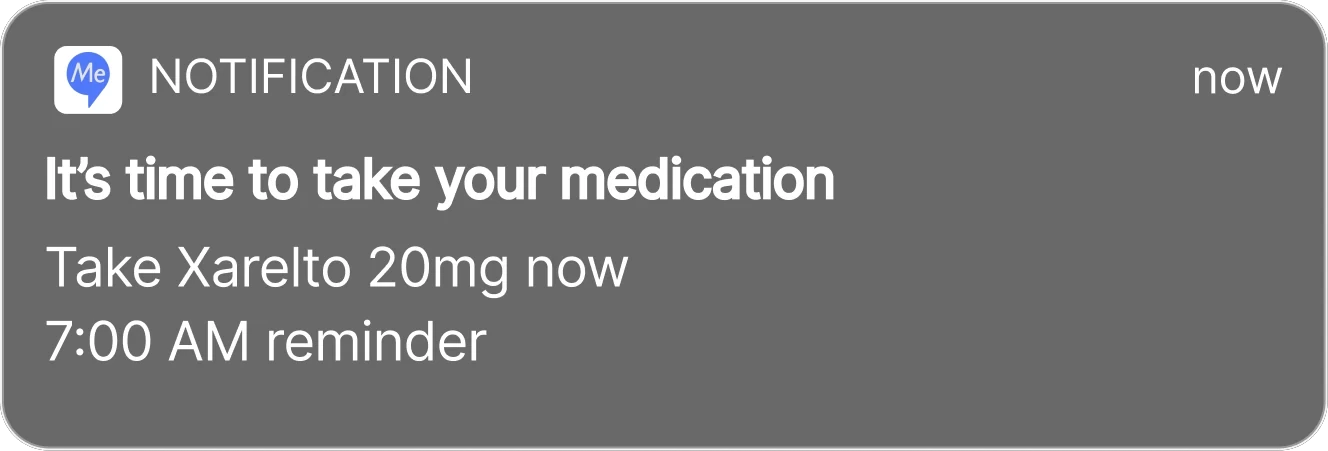
In the notification tray

On the lock screen
What shipped, and what nobody measured.
SoteriaMe was piloted through Infocare’s clinical partners across a small number of US clinics. The pilot ran without the instrumentation to measure engagement at scale, so the strongest evidence is qualitative, drawn from the testing rounds rather than the pilot itself.
Beyond the pilot, the product served a second purpose Infocare cared about equally: demonstrating that they could build a credible patient-facing digital product. Their reputation was built entirely on desktop clinical infrastructure, and a working mobile health app opened new commercial ground. It was used directly in conversations with prospective healthcare clients.
It’s easier to remember what the doctor said when it’s all written down here.
Patient, usability testing
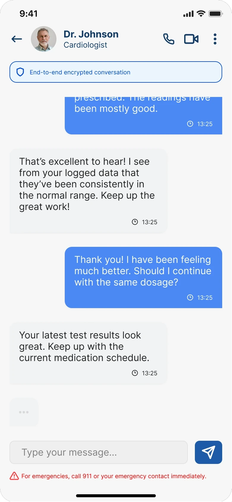
The clinician side had to hold up its end too. Every signal the app collected — logged symptoms, completed reminders, questions saved for the next appointment — surfaced in the thread the clinician already used, rather than in a second inbox nobody had agreed to check.
What I’d do differently
Running this again with a proper measurement framework, I’d establish a baseline appointment-miss rate before launch, track medication log completion in-app, and run a cohort comparison between engaged and disengaged users against downstream clinical outcomes. None of that was feasible within the project’s scope. Worth naming anyway.
Both user groups were placing trust in the product: patients that their data was safe, clinicians that what they saw was accurate. That’s a harder brief than it sounds, and it shaped every decision from the information architecture to the inline data labels.